3 min. read
Meet Passbolt UI Kit
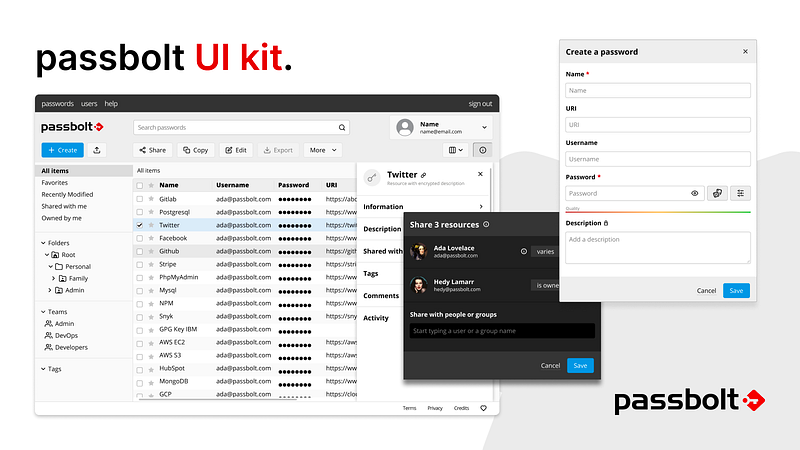
Our design system is now available as a Storybook project. It includes an extendable style guide and reusable React components which can be used as playground by designers and developers.

Vivien Muller
22 July, 2022

Benjamin
18 August, 2022
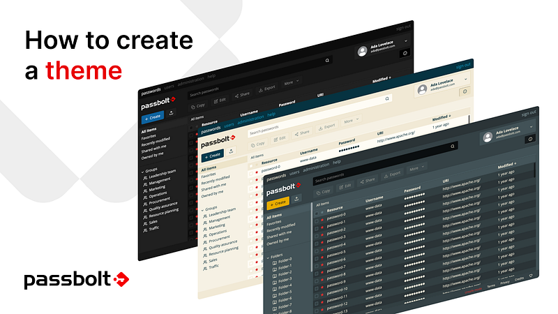
Note that this tutorial covers only the theme creation inside the UI Kit. The part II of this tutorial will follow soon and will explain how to import and integrate the new theme inside the passbolt UI.
Let’s go!
Before launching the UI Kit, node with npm must be installed on the machine.
Node: download (LTS version)
Open a terminal and follow the instructions to setup Storybook:
First, install Grunt’s command line interface (CLI) globally:
sudo npm install -g grunt-cliThen, clone the repository:
git clone https://github.com/passbolt/passbolt_styleguide.gitAnd access to the folder:
cd passbolt_styleguideNow we copy the file needed to start the creation of a custom theme:
cp src/less/abstractions/colors_custom.sample.less src/less/abstractions/colors_custom.lessThen, install all dependencies:
npm run dev:storybook:installAnd build all CSS files:
npm run dev:build:custom-themeFinally, run storybook:
npm run dev:storybook:startStorybook should normally be available from your browser at the following url: http://localhost:6006/
Open another terminal in the passbolt_styleguide project directory and execute the command:
npm run dev:watch:custom-themeThis command will watch for any change and continuously build the updates.
To see the change in Storybook, reload the page or go to another story (note: a story is a storybook section).
To make it easier to list the color palettes during the creation of a theme, a theme story that contains all the useful variables is present. You can find it under the “Foundations > Theme > Default” section.
All the theme variables have a name and description to provide a bit of context.
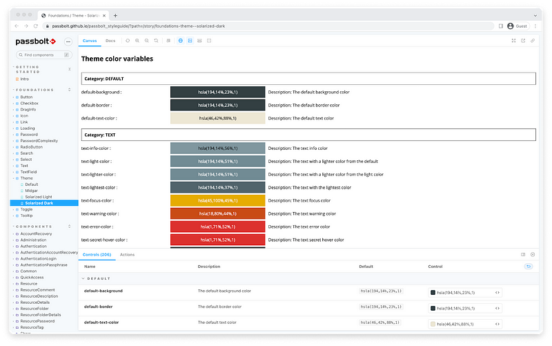
You will notice that two new themes have appeared in the UI Kit which are not available yet in passbolt: Solarized light and Solarized Dark.
These themes are based on the solarized themes, inspired by the work of Ethan Schoonover, you’ll find more information about his color palette here.
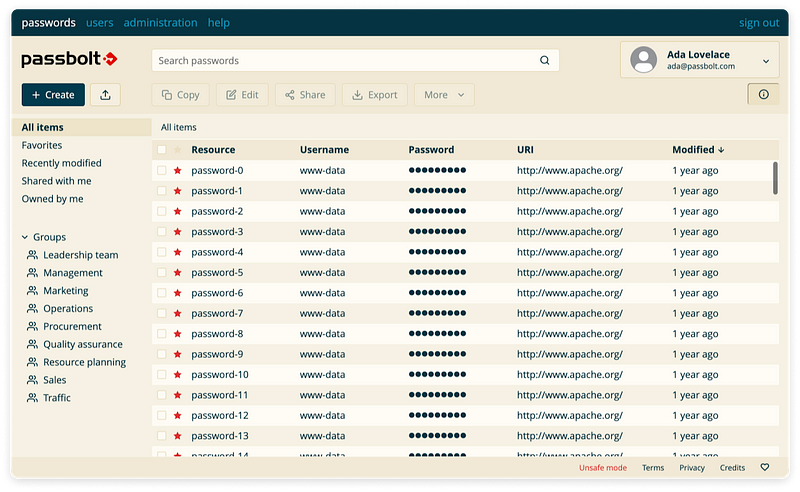
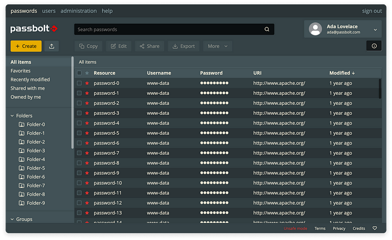
Do you like these 2 new “Solarized” themes? If yes, let us know in the community forum. The most popular themes will become eligible to be integrated in the future versions of passbolt.
To simplify the creation of a custom theme, a ready-to-use-and-customize custom theme is already provided in the storybook UI Kit. To edit the “custom” theme, you will need to work directly on the source files with the IDE of your choice. Note that it is currently not possible to edit a theme from inside the storybook itself.
The “custom” theme is mostly composed of one Less file located in src/less/abstractions/colors_custom.less. The file is mainly composed of color variables but also includes some variables referring to other visual aspects such as svg images. It is primarily this file that you need to modify in order to customize the theme.
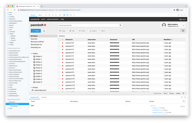
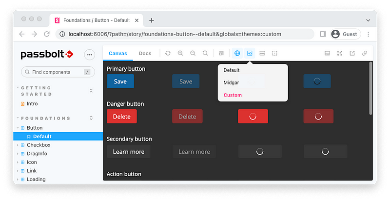
When a color has been updated in src/less/abstractions/colors_custom.less, you will need to choose the theme “custom” in the storybook so that it reflects the changes, as illustrated below.
The Less theme file uses a color palette where colors are named according to the color-name website.
/* palette */
@main-color: hsl(44,87%,98%);
@text-icon-main-color: hsl(194,81%,14%);
@workspace-bar: hsl(194,81%,14%);
@workspace-text: hsl(194,81%,40%);
@primary-color-1: hsl(194,100%,25%);
@primary-color-2: hsl(194,100%,20%);
@primary-color-3: hsl(194,100%,15%);
@primary-color-4: hsl(194,100%,10%);
@success-1: hsl(68,100%,30%);
@success-2: hsl(45,100%,35%);
@warning-1: hsl(18,80%,54%);
@warning-2: hsl(18,80%,64%);
@warning-3: hsl(18,80%,74%);
@warning-4: hsl(18,80%,44%);
@alert-1: hsl(1,71%,52%);
@alert-2: hsl(1,71%,62%);
@alert-3: hsl(1,71%,72%);
You will notice that the custom theme is, by default, composed of a few primary colors that are later declined in various shades with the use of the hsl (hue, saturation and lightness) magic. This means that it is possible to create an entire and consistent theme by just modifying a few variables, the rest of the colors will be calculated automatically.
Of course, it’s also possible to go old school and edit all the variables by hand with an hexadecimal value. This takes more time but has the advantage of providing more control.
In the file, the variables for the logo must remain unchanged.
/* logos */
@logourl: url(‘@{images}/logo/logo_white.svg’);
@passbolt-icon-without-badge: url(‘@{images}/logo/icon-without-badge.svg’);
@passbolt-icon-badge-1: url(‘@{images}/logo/icon-badge-1.svg’);
@passbolt-icon-badge-2: url(‘@{images}/logo/icon-badge-2.svg’);
@passbolt-icon-badge-3: url(‘@{images}/logo/icon-badge-3.svg’);
@passbolt-icon-badge-4: url(‘@{images}/logo/icon-badge-4.svg’);
@passbolt-icon-badge-5: url(‘@{images}/logo/icon-badge-5.svg’);
@passbolt-icon-badge-5-plus: url(‘@{images}/logo/icon-badge-5+.svg’);
@passbolt-icon-inactive: url(‘@{images}/logo/icon-inactive.svg’);
The shadow opacity variables can be changed at will:
/* box shadows */
@shadow-opacity-hover-black: 0.5;
@shadow-opacity-hover-white: 0.25;
@shadow-opacity-active-white: 0.25;
@shadow-opacity-active-black: 0.5;
@shadow-opacity-dropdown: 0.5;
@shadow-opacity-select: 0.5;
@shadow-opacity-info-panel: 0.75;
The checkbox uses a svg image for the check and it’s only available in white and black.
/* controls */
@controls-check:url(‘@{images}/controls/check_black.svg’);
@controls-check:url(‘@{images}/controls/check_white.svg’);To illustrate a new theme creation, let’s first try to remake a darker version of Midgar which we will call Black Midgar 🤘.
For this theme we’ll go old school and edit all the color variables by hand.
As you already know, a new section with workspaces has been added to visualize most of the colors at one glance. Let’s switch to the “Custom” theme and edit the colors_custom.less file.
Each of the palette variables can be directly replaced with CSS colors and can be specified by the following usual methods:
The process is quite straightforward, each time the colors_custom.less is saved, the modifications are visible on Storybook after you refresh a component.
Alright, here it is. Our black midgar theme can be created with the following color combination, available as a Github Gist for better readability.
Download the gist and replace the content of the src/less/abstractions/colors_custom.less file.
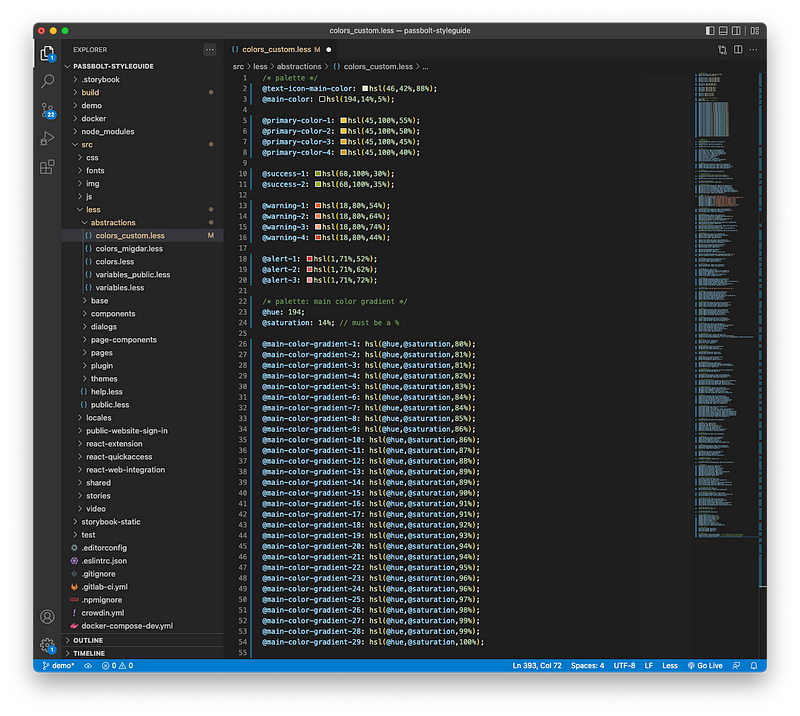
Then save it and refresh the storybook to see the magic. You should be able to see a screen similar to the one below:
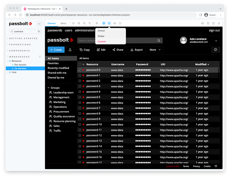
That’s it! Our “Black Midgar” theme is now ready in the UI Kit.
You may experience some limitations due to the lack of variables for the font color.
For example if the font is set to @white as well as its context background (like @input-background), the text will not be visible.
This issue will be fixed in a future release.
Once you are happy with the colors combination for your new theme, it is now time to name it. For this example, we’ll stick to the “Black Midgar” name which we enthusiastically went for above.
Copy-paste the colors_custom.less into colors_black-midgar.less.
Then, copy-paste the directory src/less/themes/custom and all its content into src/less/themes/black_midgar
It should contain the following files:
src/less/themes/black_midgar/api_authentication.less
src/less/themes/black_midgar/api_main.less
src/less/themes/black_midgar/api_reports.less
src/less/themes/black_midgar/ext_app.less
src/less/themes/black_midgar/ext_authentication.less
src/less/themes/black_midgar/ext_in_form_cta.less
src/less/themes/black_midgar/ext_in_form_menu.less
src/less/themes/black_midgar/ext_quickaccess.less
Modify all these files and make sure that they import the colors_black-midgar.less file instead of colors_custom.less
@import “../../abstractions/colors_black-midgar.less”;Then, add the new theme in the Gruntfile.js to build the css:
theme_custom: {
    expand: true,
    flatten: true,
    cwd: “src/less/themes/black_midgar”,
    src: “*.less”,
    dest: “src/css/themes/black_midgar”,
    ext: “.css”
},
Additionally, add the new theme in Storybook in the preview.js file in the themes object:
items: [
    { value: ‘default’, title: ‘Default’},
    { value: ‘midgar’, title: ‘Midgar’},
    { value: ‘black_midgar’, title: ‘Black Midgar’}
],
Note: a simpler way to customize the theme is in the roadmap, stay tuned.
Note: It is currently not possible to publish directly a newly created theme in passbolt.
If you’d like to see your theme integrated in a future release of passbolt, we invite you to submit a merge request with your proposal directly on the style guide github repository, and create a thread in the community forum to discuss it. If there are enough votes for it, we’ll integrate it first in the official style guide, and perhaps in a release later on (we can’t promise but we’ll definitely consider it).
Did you enjoy this post? Or maybe you would like us to go further and explore more possibilities for the community to create their own themes? As usual, let us know in the community forum.
❤️
3 min. read
Our design system is now available as a Storybook project. It includes an extendable style guide and reusable React components which can be used as playground by designers and developers.
Vivien Muller
22 July, 2022
7 min. read
Read about passbolt’s top moments from 2022, including releases, events, awards, and more. See our recap and what’s planned for 2023.

Shelby Lee Neubeck
5 January, 2023

 Made in Europe. Privacy by default.