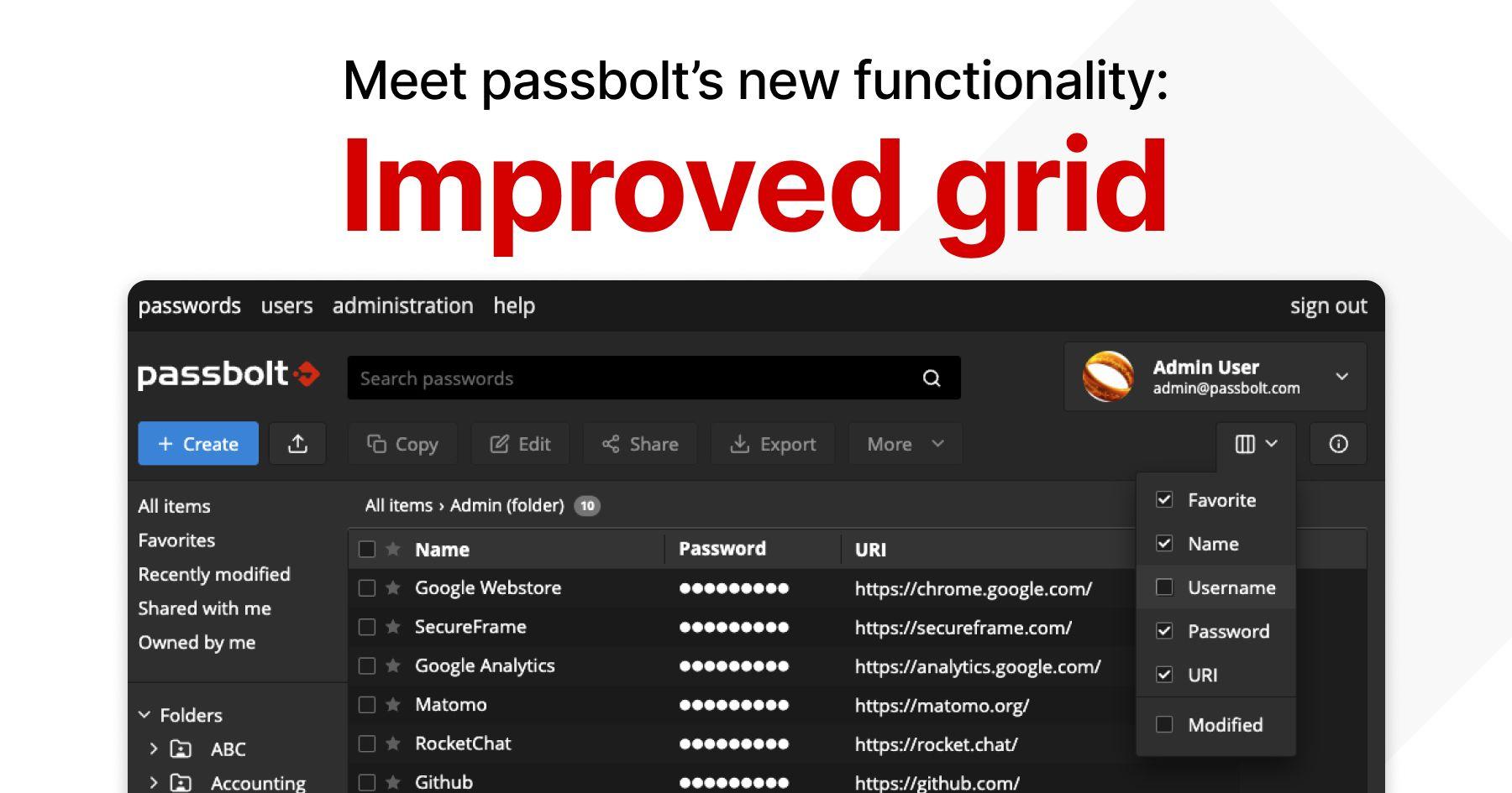
Passbolt's latest release, version 4.2, is another step toward enhancing overall user experience. This update provides users with the initial phase of an improved grid: a tailorable password workspace. With this new functionality the way you work with your credentials is reshaped, delivering improvements to customisation, efficiency and visibility.
Facing Challenges & Inefficiencies With A Static Grid
Before the release of 4.2, passbolt users encountered several obstacles that hindered their workflows. The password workspace grid was rigid, leaving little flexibility for adjustments. For instance, it was impossible to hide, resize, or reorder columns within the grid.
As with all projects, passbolt is continually evolving. A static grid worked well in the early days of the platform, but as new information was added to be displayed, it became sub-optimal. On smaller screens, information may have been hidden due to the limited space while on larger screens the overload of data may have been overwhelming. This grid limitation also posed a challenge with incorporating new features that rely on columns as it would only worsen the users experience.
Of course, the community shared these challenges and they didn’t go unnoticed:
- See the full resource name in the grid and quick access
- Resize the workspace grid columns
- Select which resource columns are displayed in the workspace grid
- See the tags associated with a password directly from the grid view (Coming Soon)
- My sort orders should be remembered
An Easy To Use Solution: Improved Grid
The shackles of predefined columns and layouts have been removed, making way for a dynamic, customisable interface that adapts to you. Improved grid introduces drag-and-drop handles so you can effortlessly resize columns for readability. Columns are not restricted by preset sizes – they flex to your preferences. When you drag a column header, it results in a visual shift, letting you find the sweet spot between information density and clarity.
The addition of a new drop-down menu operates as a pseudo-control centre, giving you the ability to hide or show columns. Now you can cherry-pick based on your screen size or data. Gone are the days of having irrelevant columns cluttering your view – you decide what information deserves your attention. And it’s all completely sortable!

Hurdles In Development
The process of developing these improvements is a story of decision making and innovation. The initial decision to be made: Should it rely on an existing library or be crafted from scratch? While opting for a third-party library could speed up development, it raised concerns about security and adaptability. Building the grid functionality in-house promised complete control, guaranteeing it met passbolt’s rigorous security standards and integrated seamlessly with the platform. Although this path does demand more time and ongoing maintenance, security will always be the top priority.
Ultimately, the improved grid was developed in-house from the ground up, eliminating the need for additional libraries and mitigating the risks associated with third-party dependencies. By taking this approach, the team benefits from a deep understanding of the code used and can create a fine-tuned user experience. The result is a tailor-made solution – a secure grid distinct to passbolt needs.

One hurdle was allowing columns to be reordered. Initially, users could drag-and-drop columns, but this proved confusing as browsers allowed users to drag an element outside of its designated area. As fun as that sounds, it wasn’t the idea. So, all column movement was restricted to the x-axis, allowing only horizontal movement. In addition, if a column was more than half the width of its neighbours, it was automatically swapped, streamlining the process.
Another hurdle was introducing column reordering without compromising the ability to scroll when the table exceeded the width of its container. The solution needed to make sure table and column widths were consistent, letting the table occupy its container fully. This was accomplished by implementing a <div> tag that reacted to mouse events, facilitating dynamic calculation and adjustment of column widths.
To show or hide columns, it was necessary to find a solution that could synchronise data between the context and the table. In this case, using a context was both practical and effective. With this technique, the table could automatically detect data changes and adjust the visibility of columns accordingly.
Overall, the improved grid was developed thoroughly, with an emphasis on user-centred design. Almost every aspect has been considered carefully, from the security and ease of use to privacy and longevity. These functionalities will continue to be developed and enhanced.
Future Improvements
The improved grid features are more than a facelift; it’s about amplifying the visibility of each resource. This is only the beginning, further customisation features will be introduced in future versions. The next releases will add new columns such as tags, icons, and more.

These improvements demonstrate passbolt’s dedication to user-centric design and community-driven development. Get started with the improved grid by updating to the latest version of passbolt.
You can find more information about the improved grid in the document with technical specifications. Have any requests, feedback, or just want to connect? Join the passbolt community forum.


